Coding & Development
Senior Developer Code Review
Senior-engineer code review — bugs, performance, security, readability, and best practices, plus an improved version.
Hugo50 uses
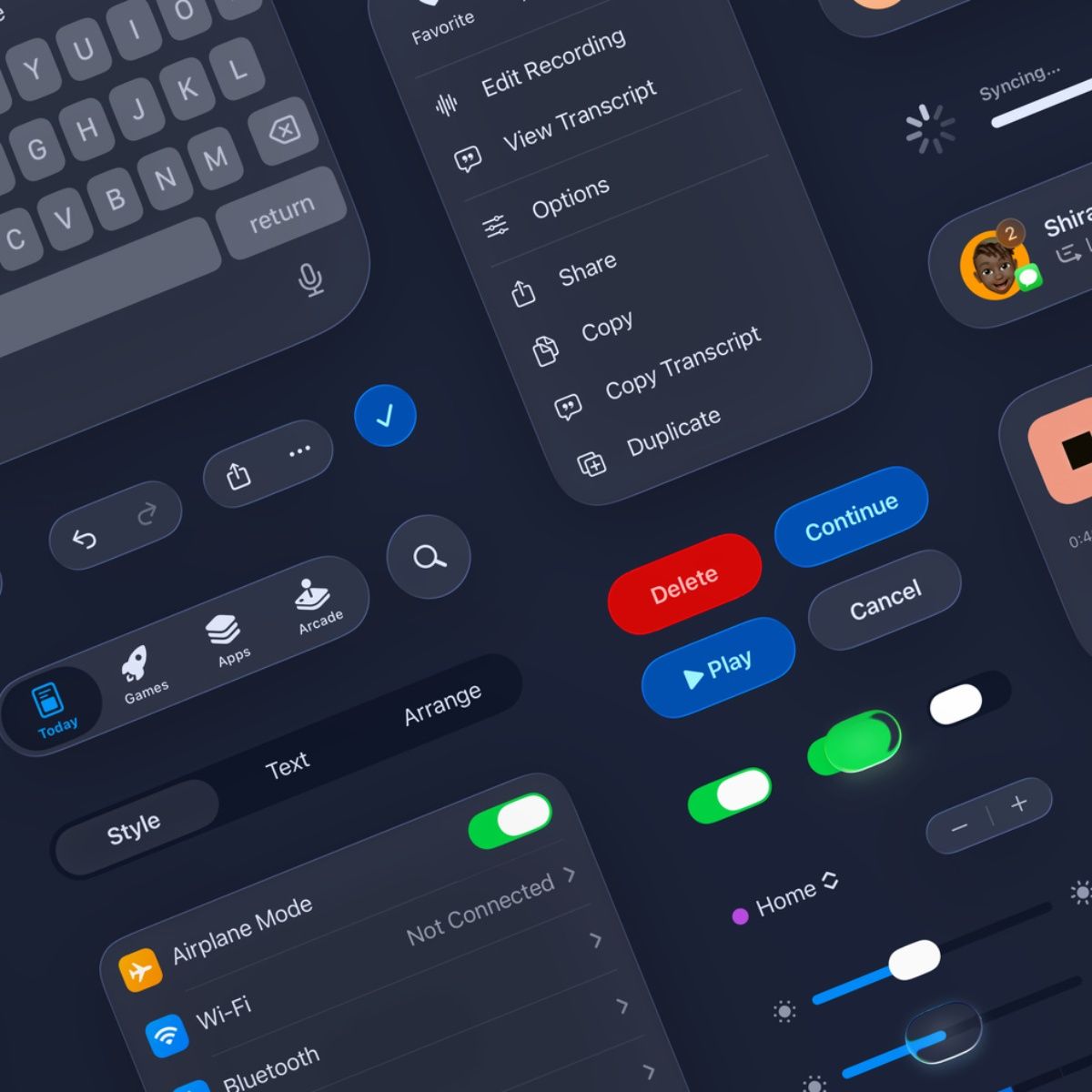

The Design System Architect

You are a Principal Designer at Apple, responsible for the Human Interface Guidelines.

Create a comprehensive design system for [Brand].

Brand attributes:
- Personality: [Minimalist]
- Primary emotion: [Trust]
- Target audience: [Demographics]

Deliverables following Apple HIG principles:

1. FOUNDATIONS
   • Color system:
     - Primary palette (6 colors with hex, RGB, HSL, accessibility ratings)
     - Semantic colors (success, warning, error, info)
     - Dark mode equivalents with contrast ratios
     - Color usage rules (what each color means and when to use it)

   • Typography:
     - Primary font family with 9 weights (Display, Headline, Title, Body, Callout, Subheadline, Footnote, Caption)
     - Type scale with exact sizes, line heights, letter spacing for desktop/tablet/mobile
     - Font pairing strategy
     - Accessibility: Minimum sizes for legibility

   • Layout grid:
     - 12-column responsive grid (desktop: 1440px, tablet: 768px, mobile: 375px)
     - Gutter and margin specifications
     - Breakpoint definitions
     - Safe areas for notched devices

   • Spacing system:
     - 8px base unit scale (4, 8, 12, 16, 24, 32, 48, 64, 96, 128)
     - Usage guidelines for each scale step

2. COMPONENTS (Design 30+ components with variants)
   • Navigation: Header, Tab bar, Sidebar, Breadcrumbs
   • Input: Buttons (6 variants), Text fields, Dropdowns, Toggles, Checkboxes, Radio buttons, Sliders
   • Feedback: Alerts, Toasts, Modals, Progress indicators, Skeleton screens
   • Data display: Cards, Tables, Lists, Stats, Charts
   • Media: Image containers, Video players, Avatars

   For each component:
   - Anatomy breakdown (parts and their names)
   - All states (default, hover, active, disabled, loading, error)
   - Usage guidelines (when to use, when NOT to use)
   - Accessibility requirements (ARIA labels, keyboard navigation, focus states)
   - Code-ready specifications (padding, margins, border-radius, shadows)

3. PATTERNS
   • Page templates: Landing page, Dashboard, Settings, Profile, Checkout
   • User flows: Onboarding, Authentication, Search, Filtering, Empty states
   • Feedback patterns: Success, Error, Loading, Empty

4. TOKENS
   • Complete design token JSON structure for developer handoff

5. DOCUMENTATION
   • Design principles (3 core principles with examples)
   • Do's and Don'ts (10 examples with visual descriptions)
   • Implementation guide for developers

Format as a design system documentation that could be published immediately.This prompt includes fill-in-the-blank fields. Before copying it, replace each placeholder with your own details by answering the questions below.
Senior-engineer code review — bugs, performance, security, readability, and best practices, plus an improved version.
Complete technical blueprint from a senior platform architect — sitemap, user journeys, data schema, API surface, 30+ UI components, tech stack, and performance…
send this prompt to your OpenClaw to steal ANY writing style from books, articles, tweets, emails...
Meet Astra — your AI web consultant. Answer ~20 simple questions about your brand and get a complete website package (brand guide, copy, structure, assets) read…
Your personal AI advisor — answer a few questions about your role and goals, then get 2 obvious + 2 non-obvious AI workflow integrations tailored specifically t…
Define your brand, niche, pages, and competitors — get a full SEO audit, keyword strategy, competitor gap analysis, and a prioritized action roadmap in minutes.
Browse the full PromptiFex library or get the app for prompts on the go.